
04 Dec The A to Z of typography terms
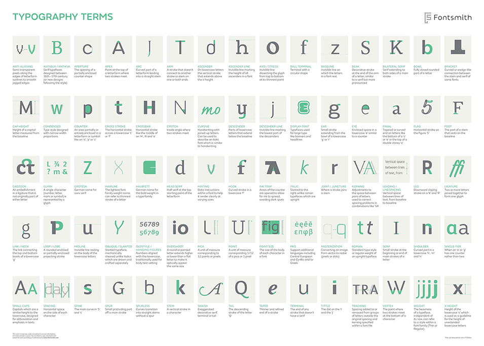
Do you know your aperture from your apex? How about the difference between a finial and a flag? If not, then this infographic/typography tutorial from Fontsmith will get you up to speed in no time.
Illustrating the A-Z of typography jargon, with each entry accompanied by a short description, this infographic uses Fontsmith’s new typeface FS Aldrin – the technical and precise design seemingly the perfect fit for describing the different typographic terms.
“As type designers, we can get immersed in an insular typographical bubble at times,” explains Type Design Director Phil Garnham. “It’s easy to forget that our language, the lingo, words and terms that we use to discuss, critique and refine our designs is under the constant pressure of discourse and scrutiny within, often redefining itself.
“We thought that it would be an interesting project to research and illustrate a few of the key words that we use everyday here in the Fontsmith studio but then before we knew it we were up to nearly 80 terms! Unable to cut the list down we’ve prepared this infographic that lists all the vocabulary in one place.”
Story via Creative Bloq.